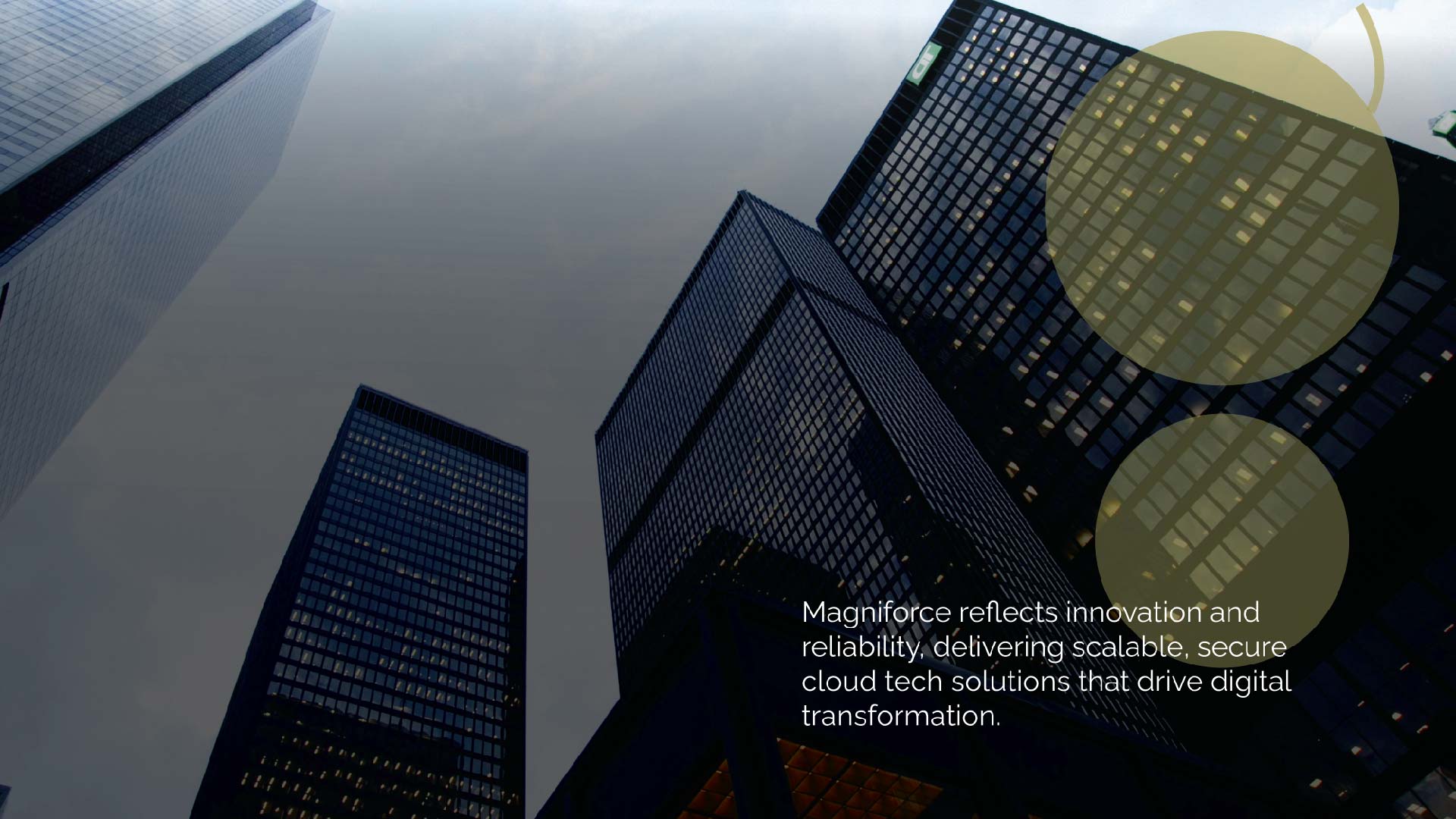
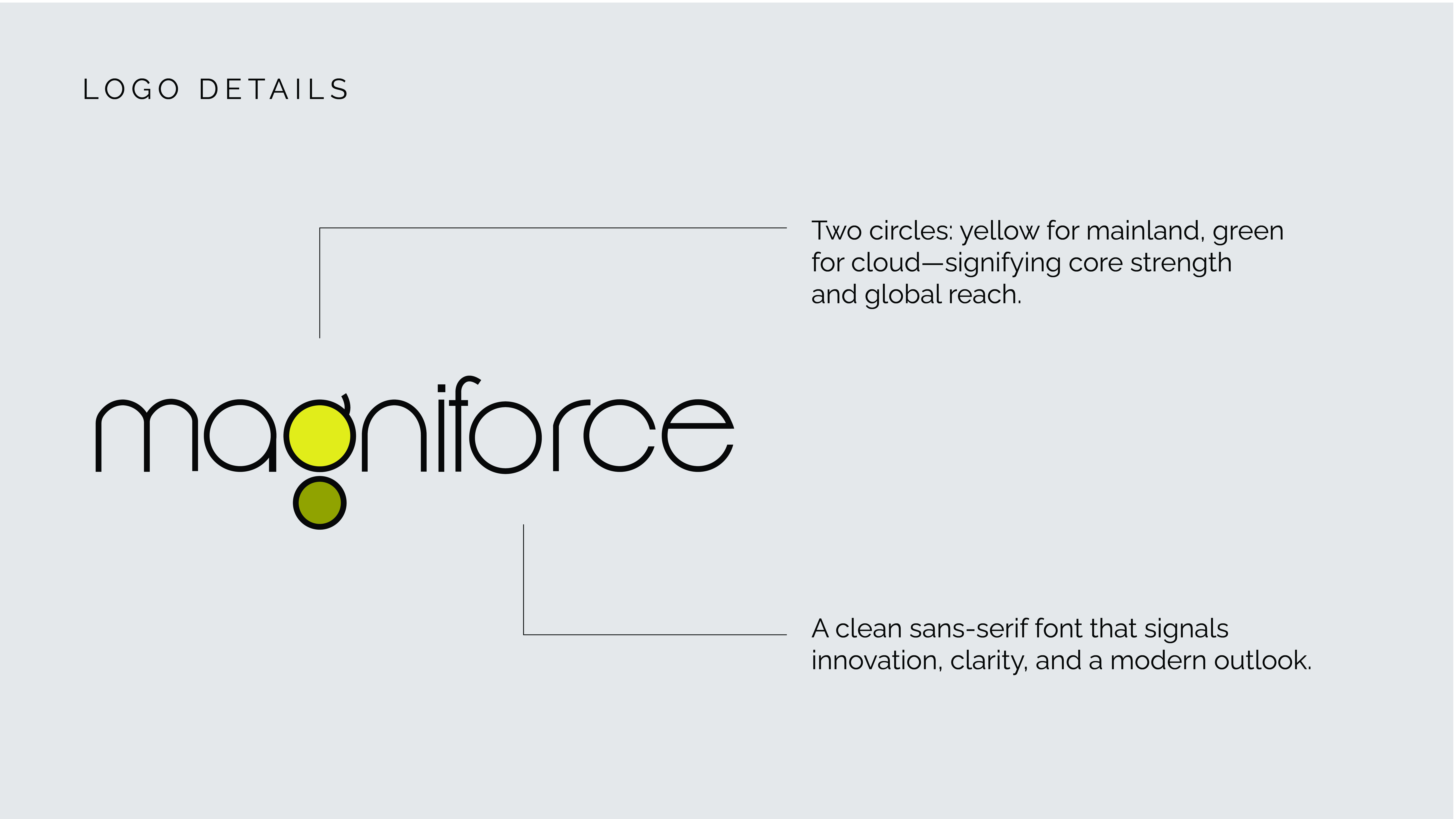
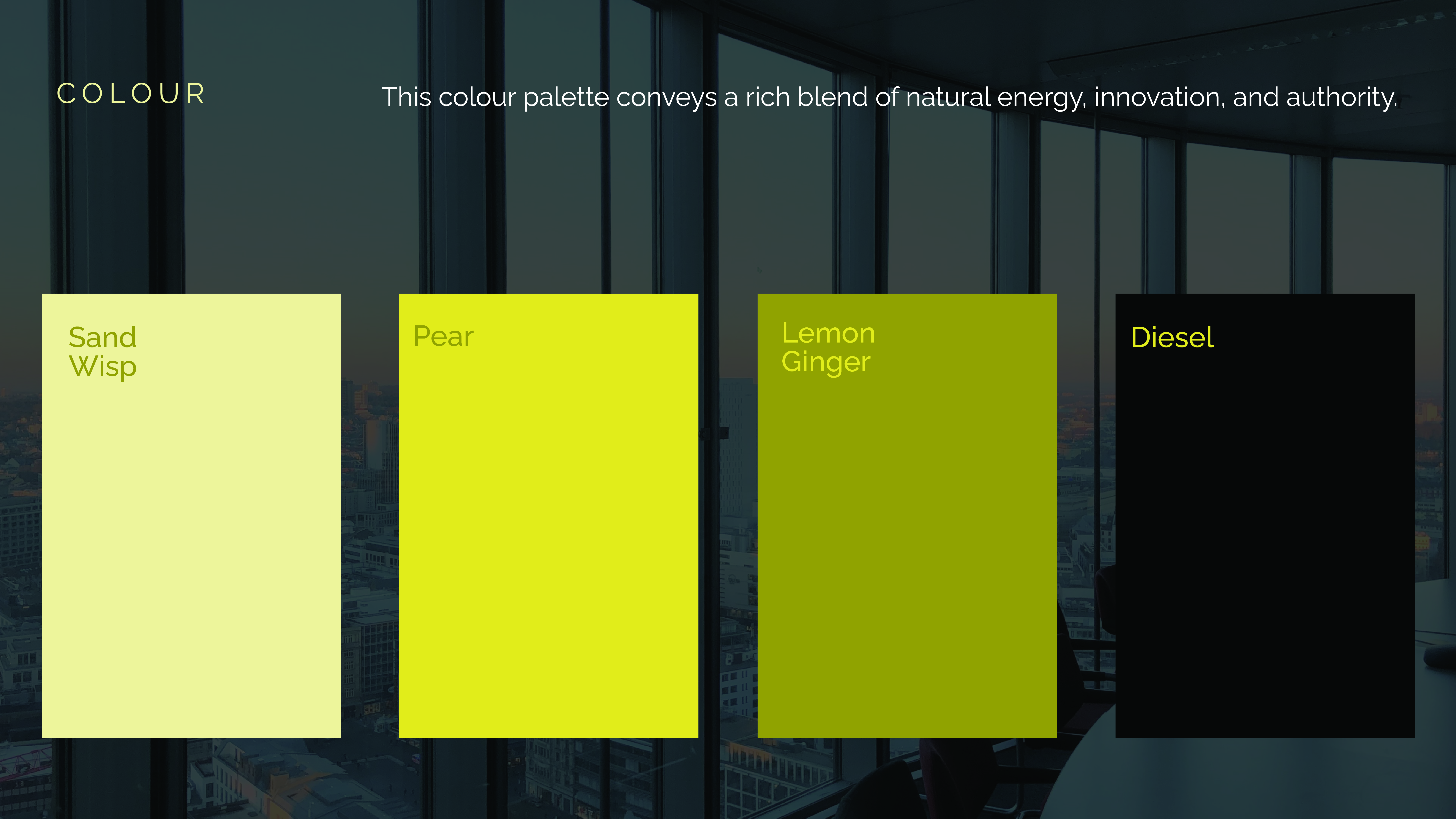

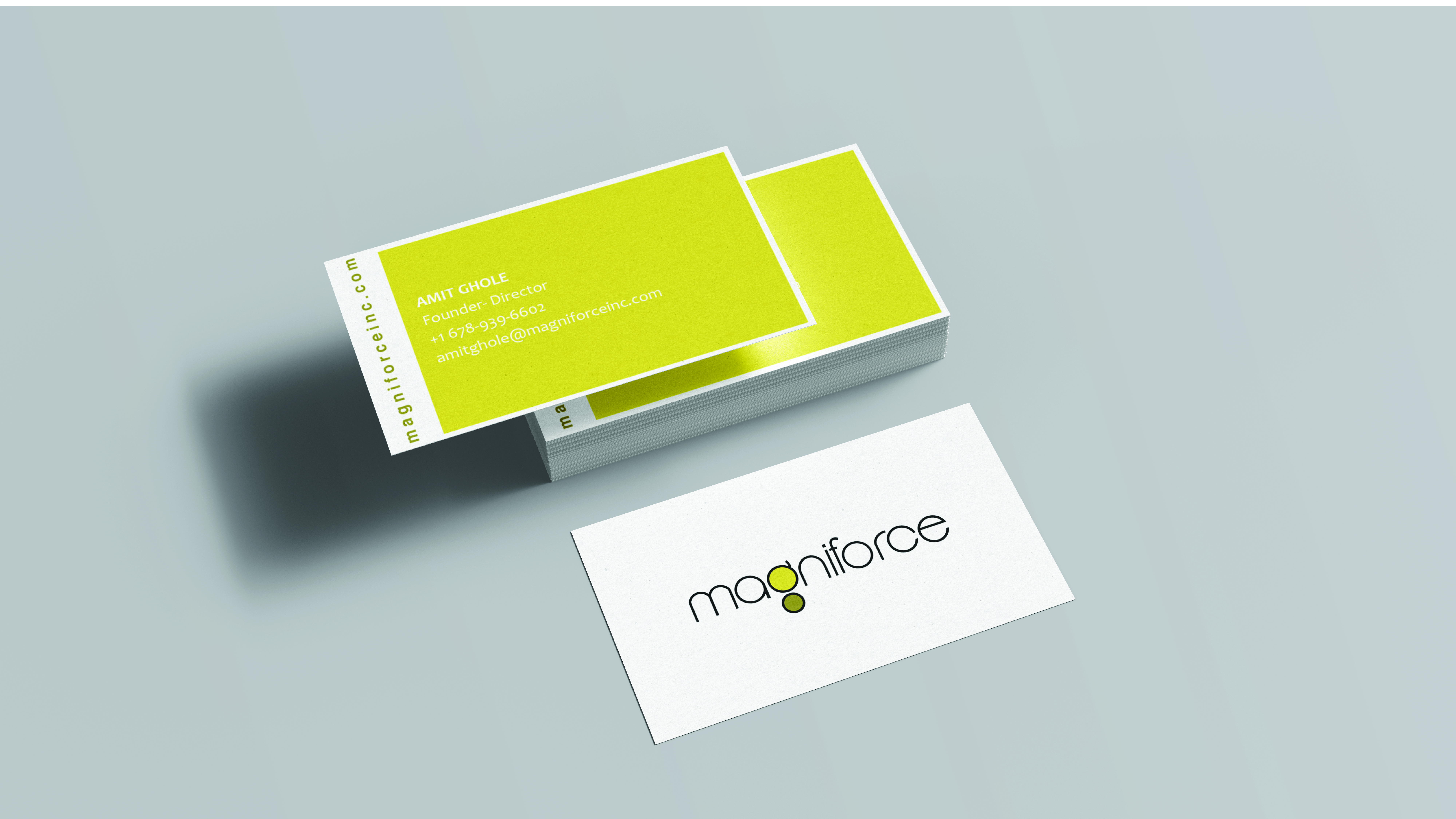
Adopting a bright and lively brand colour is a sure way to stand out in the crowd. New age brands are coming out the grey-blue ‘corporate shell’ with bright and bold brand colours that stand for youthful exuberance. When designing the brand identity of Magniforce, we ditched the old world blue for canary yellow and sap green.
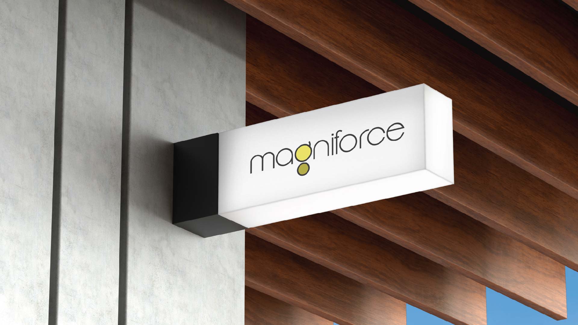
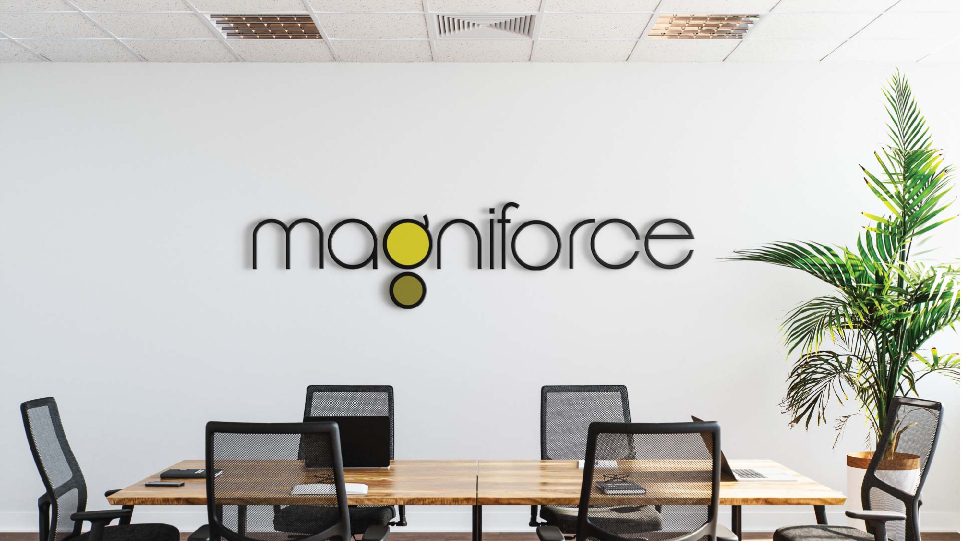
Magniforce is a cloud-based technical service provider that works across locations, languages and industry verticals. The logo is a minimal typemark identity that highlights the letter ‘g’ in colour. The alphabet is divided into two circles, the larger yellow circle denotes the mainland and the smaller green circle denotes cloud-based service exported across geographical space.
Category:
AdvertisingDate:
June 8, 2000

